
Bob Holt
Thursday, June 11, 2020 | 7 minutes
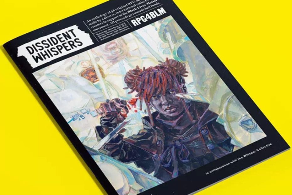
Dissident Whispers
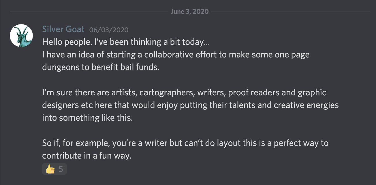
Back on June 3, in the midst of justified unrest demanding that BLACK LIVES MATTER, this message was posted to the Exalted Funeral Discord:
In less than 2 weeks, we would publish a 136-page anthology of 58 RPG scenarios from over 90 contributors in 16 countries around the world. This is that adventure from my limited perspective.
Dipping a Toe Into the Water
Silver Goat went on to create a new Discord server for discussing the project. I joined it the next day, and mostly lurked. I created a template for layouts with Scribus (that I think only I ever used 😂), weighed in on discussions about fonts, and generally tried to be helpful. I put my name in the pot to do layouts, but otherwise stayed about a step back from the project as others took the lead and started making decisions on how to organize.
As things started to coalesce, I still stayed in the background. In the first few days, several amazing creators had already stepped up and promised projects: namely Chris McDowall (Electric Bastionland), Sean McCoy (Mothership), and Johan Nohr (MÖRK BORG). Would anything I could do be good enough to stand alongside their work? I wasn’t so sure.
So I thought about it over a weekend. I wrote a couple of things for this site. And then I saw this tweet:
PSA: I’ve received this question a lot and it just came up in my Discord–
“what can I do for a fundraising stream helping black people? What are some things you recommend?”
Honestly? This is a time to just RAISE MONEY. — Aunt PT, 33 & BLACK YEAR ROUND 🏳️🌈 (@pleasantlytwstd) June 2, 2020
This project would be a way of taking a little effort and turning it into a lot of money, so Monday morning I checked back, saw they were concerned about having enough layout help, and got a job doing that.
Temple of the Blessed Twins
Once I figured out the labeling system for the project in Trello (which was actually very intuitive), I found an adventure that I thought I could tackle. As I mentioned before, my background was in newspaper layout, so my intent was to find something that I could do a pretty straightforward layout for that focused on minimal design and clear typography. I found a likely candidate in Dave Sokolowski’s “Temple of the Blessed Twins,” which had the added enticement of a beautiful map by Abigail LaLonde.
Luckily, Dave was amenable to clean and clear, so off we went.
I struggled a bit with the number of random tables. I tried really hard to make them not break across any columns. At a two-column layout, this was next to impossible, but I looked through the layouts that had already completed and saw that a three-column layout could work. It would tighten up against the short lines and potentially save space. It ended up saving exactly the right amount of space.
The rest of the layout artists called it “clean,” but suggested I add some color. Since blue and yellow were recurring color themes in the adventure, I went with those. I started with the blue and yellow from the Swedish flag and adjusted slightly from there.
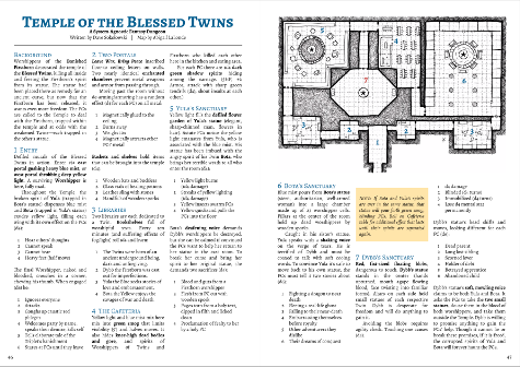
Apologies for the small size, but you’re going to have to buy it to read it.
Self-Critique
There are a couple of things I would change now that I’ve had time to step back and take a look. First, I would likely use a smaller typeface for the random tables. I like that they are readable, but they could do with being a bit smaller than the main text. I would also likely lightly shade alternating rows of the table just to add a bit more color and draw attention to the specific lines. There are also the occasionally widow/orphans that I would play with spacing a bit to give homes to.
I may have more thoughts once I see it in full-color print, but those are the only minor things I would change, and overall I’m very happy with it.
Graktil: The Citadel that Crawls
After I finished up Blessed Twins, I went looking for another challenge. At almost that exact time, Horatio Hellsing put out a call for someone to do the layout on “Graktil: The Citadel that Crawls,” and specified that this person needed “Big Goblin Energy.” I was interested, and claimed to have that “Big Goblin Energy,” but not the “Big Goblin Layout Expertise.” But, I looked over the adventure, and had some thoughts how I might lay it out, so I took it on.
When I asked Horatio if he had any design thoughts in mind, he pointed me at Trilemma Adventures, and I was like “My man!” Trilemma is laid out so thoughtfully, minimalist, and clean that I figured it was right up my alley. I was a little bummed that I couldn’t try a full “mörky-borgy” layout, but knew I could deliver something my author would like.
So I set it all out in nice tidy columns, dropped in the map, and… it was okay. Horatio, to his credit, expressed love for it, but the feedback from the other layout artists was that I needed to “chaos” it up a bit. Horatio agreed. So, I set about doing that.
The thing about traditional newspaper or magazine layout is that you put a giant text box over the whole page, set the number of colums, put the text wraps on your images, and call it a day. But to chaos it up, I had to break each section of text into its own text box, and set them all slightly askew. It actually sounds (and sounded to me) like much more work than it ended up being.
A couple of hours later, I had a layout that both the other layout artists and Horatio loved. I did a little work on colors and some edits on the hand-drawn map, and voila: we were done.
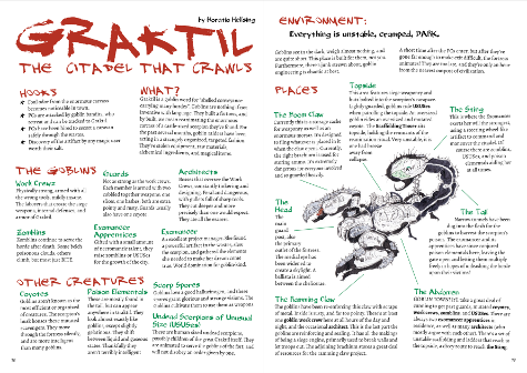
Still gotta buy it.
Self-Critique
I have to say that (with full recognition that I am not a professional and it’s my second RPG layout) that I’m incredibly happy and proud of this. I think the growth I had to go through to make this look the way it does was big.
I do see a couple of things. Mostly, it still looks a little too clean to me. Doing it again, I would likely drop in a more textured background or something. The drawback there is that we would lose contrast on the text. I tried to be very cognizant of text contrast for accessibility, and putting a texture back there would force me to either compromise on the contrast or to go even darker with the red and green: in which case the green might as well be black. In Conclusion…
I’m incredibly glad I worked on this project. If something else like this comes up in the future, and you’re on the fence, I highly encourage you to give it a shot.
Big shout-out to the community here. They gave great feedback and pushed me to do my best work for me at the time. I’m very happy with how everything turned out. I’m proud to have my work sitting next to and a part of that so many talented people worked on.
And most importantly, I’m glad that this thing that we all collaborated on is doing so well. In the first 24 hours it was on sale, we sold over 1,000 copies and raised over $25,000 for the National Bail Fund Network.
If you don’t have yours already, go pick it up. It’s available in both print and PDF from Tuesday Knight Games, DriveThruRPG, and Itch.io. You can find all of your purchasing options at https://whispercollective.org/.
We hope you enjoy it. Black Lives Matter.
Previously published on www.scopsong.com